Showing posts with label usability. Show all posts

Saturday, April 13, 2024

"I'm not smart enough to use this"

 I quite often use the phrase "I'm not smart enough to use this" when working with software tools.


This is actually a code for one or more of the following:

  • This doesn't work the way I expect/want/need.
  • I'm not sure how to do/use this correctly.
  • I'm disappointed that this didn't stop me from doing the wrong thing.
  • I don't understand the error message (if any) that was displayed. 
  • Or the error message didn't help me understand what I should do.


Do your users/customers ever say similar things?

Would they tell you?

Are you set up to hear them?

And ready to hear this?


Or will you tell me that I'm "holding it wrong"?


Wednesday, February 21, 2024

Working with time is hard - why the film starts in "1 hour and 60 minutes"

Recently, I saw a display inside a cinema that said a film was starting in "1 hour and 60 minutes"

Be careful how you round times and parts of times before displaying them!


As 1 hour is 60 minutes, why didn't the display say the film starts in "2 hours"?

I can't say for sure, but I'd guess that the actual time until the start is 1 hour, 59 minutes, and more than 30 seconds.


Because there are less than 2 hours in the difference between now and the start, the hours were reported as 1. As the hours have been dealt with, they moved on to calculating the number of minutes. Because the number of seconds wasn't shown, the number of minutes was rounded to the nearest value. As there are more than 30 seconds in the timespan, this was rounded up to 60.


Ok, this is an edge case that happens in a very small window of time. Most people (customers & potential customers) will never see this.


Why does this matter?

Why care about such potentially trivial issues?


If your customers can't trust the simple things they can see, why should they trust you with things they can't see?

If your app is slow, unresponsive, crashes, displays duplicate information, displays obviously incorrect information, has usability or accessibility issues, or any of dozens more things, why should people trust you with things like:

  • Keeping data secure?
  • Keeping data accurate?
  • Making calculations correctly?
  • Meeting regulatory requirements correctly?
  • Charging correctly?
  • Maintaining a reliable service?


If the visible parts don't show care and attention to detail, why should the people using your software assume that you've spent more time and focus on the things people can't see?


Wednesday, March 09, 2022

What's wrong with this WinUI code?

Here's some simple code.

There are probably many ways you can see that it could be different, but there's one major potential problem with this code. Can you see what it is?


private async Task OpenInBrowserAsync(Uri uri)
{
    await Windows.System.Launcher.LaunchUriAsync(uri);
}


The problem with this code is that it contains an unprotected "seam" between the code that's part of this codebase/application and code that isn't.


I'm going to use "your code" to mean the code that's written by you and "other code" for everything else.

Anywhere there's a place where your code meets other code, it creates a seam. A seam is where there's a potential weakness. When two things are connected or joined together, there's a potential for problems. It's where defects or issues are most likely to surface.


Let's go back to the code above. When LaunchUriAsync() is called, three things could happen.

  1. The URI could be opened in the default browser. This is what is expected and will hopefully occur most of the time.
  2. There could be an exception thrown by the other code.
  3. Something could happen that means the provided URI can't be opened, but no exception is thrown.

(Yes, other possibilities exist but won't be covered here.)


Scenario 1 is the easiest to think about. Everything works as expected, so we don't need to discuss this further.

Scenario 2 is vital to consider as it's likely to have a significant negative impact on the people using your app. Hopefully, it'll never happen, but it's always a possibility. You don't want other code to cause your app to crash. The people using it will still blame you. That an exception has its source in other code doesn't matter. That any potential exception is also coming from async code has the potential to increase the possibility that the exception could crash the whole app. Handling the potential for other code to throw an exception is essential!

Scenario 3 is easy to overlook. That code "works" or throws an exception is easy to appreciate. That there's a middle ground--where it "works" but not as expected--can be harder to appreciate and allow for. However, it's equally important for the people using the app that you allow for this as it is to handle exceptions.
If someone uses an app and when they do something, it causes the app to unexpectedly crash, it's easy to know something is wrong. But what happens when the person does something (click a button, select an option, whatever..) and nothing happens? The thing they wanted or expected doesn't happen, but neither does anything else? Do they try and do the action again? Could that have separate, adverse side effects? Is it being slow? Or slower than usual/previously? Did they do something wrong? Is the app broken?
Creating uncertainty in the minds of the people using your app is not something you want to do. It does not lead to happy users. Unhappy users lead to less usage, fewer sales, fewer recommendations, bad reviews. Nothing good.

As per the documentation, the method returns a boolean value to indicate if the URI could be launched.
Ignoring responses is not always wise and is certainly not a "best practice."

In programming, it's usually good to call a method and trust it will do the thing that's asked of it. However, a function that returns an indication of whether it could do the thing that was asked of it is not to be ignored.
Imagine asking someone if they can do something for you but sticking your fingers in your ears when they say if they can do it or not. You could assume that they can and will do it for you. But, if they say they can't, and you carry on assuming they can (and will), whose fault is it when it doesn't get done?

Do you like ambiguous code? Do you like using software where you can't be sure if it's working as expected? Do the people using your app like software that works like this? If not, don't give it to them.


Connected with the above is the issue of testability.

As the above is a small snippet of a larger codebase, it's not clear how (or if) it is tested. But we can assume it probably isn't.

It might be appropriate to abstract the interaction with the other code to make it possible to easily (and automatically?) test different actions and responses. Such tests can be more important than tests related to your own code, as it's often harder (or impossible) to forcibly get every possible response from other code so it can be tested.


So, what should the above method actually look like?

Well, here I might disappoint you. There is no single "best practice" way to write a version of the above method.

Instead, a "leading practice" would be to handle the response from the method, acknowledge that an exception is possible, and make it possible to test for such scenarios.
Maybe I'll show you an example of such code in the future. Let me know if you want to see it.


The above doesn't only apply to code that is part of the WinUI API.

This applies to any code that you didn't write. It might be an API from the platform, or it could be any library you're using. Any "seam" between code you write and code you didn't needs to be protected.


This doesn't (hopefully-obviously) only apply to WinUI related code, but I found a variation of the above amongst code that was supposed to be an example of "best practices." In lots of ways, it's definitely not a good example but I called this out in relation to WinUI as developers building with it deserve the best help I can give.


Monday, February 28, 2022

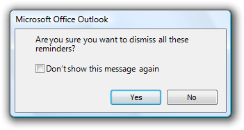
Don't show this message again - avoid vague options

"Don't show this message again" button

You've probably seen options like the one above used throughout the software you use.

It might be clickable text like that shown above or as an option with a CheckBox for you to check to indicate an answer you want to always be used in the future.

In theory, this is a good option to have.

As a general rule, you don't want to repeatedly prompt the person using a piece of software to give you the same information over and over again.

Similarly, you don't want to be telling the person using the software the same thing over and over again. They might not need to be told every time and you're likely to annoy or frustrate them if you do.

They might also start(?) ignoring any messages like this and inadvertently miss/ignore something new and important as it looks like something they've seen before.

[Aside: information, warning, and error messages should always be easy to distinguish between. Don't for example, make all of them the same color so the only way to differentiate them is to read the text.]


However, displaying a message like this raises questions for the person using the software.

  • What is it that won't be shown again? 
  • Is it the exact, specific scenario, or all ones like it? (If the message is about one account/file/project/etc. will selecting this option stop it from being shown again for all accounts/files/projects/etc. or just this one?)
  • Does my answer apply to all variations of the displayed message/scenario?
  • Does it include displaying the message only in the same circumstances that caused it to be shown? (What if other circumstances or scenarios also warrant showing that message? I might want to see the prompt then.)
  • Could the same (or very similar) message be shown for a different scenario?
  • What if I want messages or prompts like this to be shown again? (at some point in the future.) How do I (re)enable that?

Yes, I'm someone who can often look at prompts with the "don't show this again option" and think about the possible future scenarios where it might be useful to get that message again. It's often easier for me to just ignore that prompt than try and figure out exactly what selecting the option might do.


When showing such an option, I can see that you're trying to be helpful but now you're adding complications and asking me to make a decision where I don't know the consequences of each answer.

Ideally, the software a person is using should give that person confidence and not raise doubts or questions about the thing you're doing to try and help them. Admittedly, for very large and complicated software that won't always be easy.

I'm not trying to argue that you should never use a prompt like that shown and described above. They can be very useful.

I'm saying that you need to consider the use of these messages and test they are understood by the people using the software. You want your improvements to actually improve things for the people using the software. Adding more prompts and options isn't always the best answer.


Thursday, December 31, 2020

Validate everything - why I no longer trust my supermarket

photo of a receipt highlighting entry: EASY PEELERS LSE 88.297 kg @ £1.95/kg  £172.18

The above is from the receipt when visiting a supermarket earlier in the year.
Yes, it's an entry for 88.297 KiloGrams of loose fruit at £1.95 per KG, coming to a total of £172.18!

That's almost 200 pounds and the weight of a grown adult!
It's also (to the best of my memory) more than I've ever spent in a supermarket at one time.


tldr1: Don't blindly trust ML/AI algorithms without adding extra data validation.
tldr2: Double check your receipts!


So, how did this happen?

During the lockdown, I made my once-a-week trip to the supermarket for essentials.

I used the "Smart Shop" app on my phone to scan and pack items as I shopped.
There are several possible benefits to using the app, but, to me, the biggest was reduced time with a cashier when we should be doing "social distancing."

The following is an explanation of a specific issue I've observed with the app.
I'm realistic enough to know the app won't be perfect, especially with my high standards.
There are some other issues that I regularly encounter (most times, I use the app), but I don't think they are worth exploring here. (If you're interested, these include the "scan" button disappearing and not allowing me to scan other products, and the scan button being unresponsive, leading me to press it again, which leads to the scan mode briefly being displayed before automatically closing again.)

I was doing my weekly shop, navigating my way around the store, and got to the confectionary aisle. I was choosing some treats for my children and saw something I thought my wife would like. I picked it up, scanned it. I wasn't paying attention to the app but heard the positive "beep" of a successful scan and put it in the trolley without looking at the screen.
A few minutes later, I noticed the running balance was significantly larger than what was reasonable based on my trolley. I was only shopping once a week, so spending a bit more than I had in the past, but this was way beyond anything reasonable.
I was able to scroll back through the list of everything I'd purchased and found the rogue entry. Based on the items before and after it in the list, I worked out what item was missing based on what I'd put in my trolley and where the erroneous entry had come from.
Cautiously I tried scanning the item for my wife again, and this time it showed up correctly. 
I tried removing the incorrect entry, but the app wouldn't let me without scanning it again--which was obviously impossible.
When I had gathered all my shopping and was ready to pay, I found a staff member to explain what had happened. They tried to remove the entry but required managerial approval because of the high price of the item. (Aside: why is managerial approval needed to void an item that doesn't require managerial approval to purchase?)
The item was eventually removed, and I paid for my shopping. Nobody in the store was interested in finding out more about how or why this had happened, and so I went home. (I'll save my rant on front-line customer service workers who aren't interested in escalating technical issues for another time.)

This experience weighed on my mind and left me with two big questions.
  1. How did this item end up on my list?
  2. How is this item even possible?
In reverse order.

How is this item possible?

The entry is for a product the weight of a grown adult.
The scales in the store don't support that much.
It's not physically possible to balance that many items on the scales.
How is this deemed valid?
It's a tremendous amount, so it should have raised an exception.
Why is there no default flagging or limits on the weight and total price of an individual item?
There was a check when removing the item, so why not on adding it?
Perhaps there's an implied check based on what the scales can measure, so a check wasn't deemed necessary. If the scales/printer can't print a barcode label for an item that heavy or expensive, why is it necessary to validate the value?
As we shall see, the system is based on the fact that it relies on accurate scanning, and my experience is that what is in a barcode and what the software reads can be different.


The troublesome item has what I'll refer to as a 'self-weighed barcode.' (It's a few years since I worked in a supermarket, and I don't know the terminology they use.)
These self-weighed barcodes contain two parts: an identifier for the product and the price of this particular item. This is how the correct price is charged without creating an entirely unique barcode for every weighed item.
This system is at risk of abuse, but that abuse is presumably deemed acceptable. If you've ever heard of someone weighing and printing the label for a small handful of grapes and then sticking the label on a bag containing a much larger number, you'll understand the risk. But, most people are honest, and so the amount lost by the supermarkets in this way is less than they save by not having to have everything preweighed or paying for staff to weigh them.

So, hopefully, you can see what the system thought I'd scanned, but...


How did this item end up on my list?

Or, as a bigger, more general question, how did a different item from what I'd scanned show up on my list?


Firstly, let's consider if this matters.

If it's a different product.

The store's inventory management will be out. They may think they've sold more (or less) of products. They probably allow for small discrepancies, so this may not be a problem. Whether 200 pounds of fruit counts as a small discrepancy, I can't say.

For the individual making the purchase, there are two potential consequences. Firstly they will have no proof of purchase of the product they put in their trolley/bag and so won't be able to return it or get assistance/replacement if there's a problem. The second consequence is if they are asked to verify that their shopping contents match their receipt. This may be a security check or a random check applied to all users of self-scanning systems. At best, this might require the rescanning of all items or, at worst, may be seen as an attempt at shoplifting. Good luck proving the issue was with their software if you're accused by them of shoplifting.

What if this affects an age-restricted product?
Customers may have to get their purchases checked unnecessarily. But, potentially more concerning is people buying age-restricted products without appropriate verifications being made. If my discovery has found a flaw in the supermarket's software, could this be exploited to purchase age-restricted products by people below that age? What are the legal implications of this?

If the prices are different.

If the price charged is less than it should be:
  • The store will lose money and may try and accuse you of deliberately underpaying. It might be hard for them to prove guilt, but it'll be harder for you to prove innocence. At any rate, it has the potential to be an unwelcome and stressful exchange. Again, a small discrepancy may not be worth the company's effort to change their systems to address.
  • If you're undercharged, then you gain. Bonus.

But if the price is higher than it should be...
  • The company won't mind. For them, the occasional over or undercharged item will probably cancel out.
  • Legislators might be interested, but I don't know enough about this area to say for sure.
  • For the individual, this could be a big deal. If, as in my case, it's a large difference, this could have a big impact on a person's finances. A large discrepancy is likely to be spotted, but multiple smaller differences might not be. What if you were regularly being overcharged?

How many times has this happened before, but the price difference wasn't large enough for me to notice? - It's a worrying thought.


So, what's happening when the wrong product/price show up?

Let's start by looking at the process as a whole. Here's how it's supposed to work.
  1. I scan the product with the app on my phone.
  2. The app decodes the image to identify a barcode.
  3. The data (barcode value) is sent to the server.
  4. The server responds with the product and price.
  5. Repeat for each product.
  6. At the end, the device/app sends all data to the till.
  7. I pay at the till. - Done.

The possible causes of the issue are either in the app, on the server, or in communication between them.
  • If it's a communication issue, it could be one of data corruption or a man-in-the-middle attack causing data corruption. I don't think either of these is the cause of the issue I encountered.
  • It could be that the server sent the response to the wrong device. Perhaps somewhere else, someone did scan the product that showed up on my device, and the messages got mixed up. Perhaps someone else scanned all that fruit and was only charged for some chocolate. This again seems extremely unlikely.
  • Perhaps the server was misconfigured, and it thought the barcode for the chocolate was the expensive fruit. That I scanned the chocolate again and it showed up correctly suggests this isn't the case. Of course, an invalid server configuration could have been corrected between the two times I scanned, but I think this is very unlikely.
I think the problem was with the software in the app that "reads" the barcode.
The app is running on my phone. My phone doesn't have a dedicated barcode scanner, but it does have a camera. The app uses the camera to take an image (well, it probably scans frames of video) and looks for a barcode image from which it can extract the value. (Years of building software that prints and scans barcodes have taught me a thing or two about how this works ;)

I think the "barcode scanner" software extracted the wrong value from the image/barcode, and it just happened to be something that the server considered valid.

I think this is what happened because when using the app, I regularly (it probably happens every other week) "scan" an item and receive an error message that the item is not recognized. I can "scan" the barcode again, and it goes through correctly. Is it that the barcodes are added to the system between the times I scan them? Or, is it more likely that the app sends invalid data because it "misread" the barcode?
Based on my knowledge of barcodes and image recognition, I think the app is "reading" the barcodes incorrectly. 
Don't get me wrong, I think the image recognition is impressively good. Sometimes it even reads barcodes that my knowledge of barcodes and laser scanners surprises me as I thought they'd be unreadable.

But, I know that the "barcode scanner software" isn't "reading" the barcode the same way that a laser scanner does. It uses AI (a machine-learning-based algorithm) to work out the best guess for an image's barcode value.

In this instance, I think I was "lucky" and encountered an incorrect barcode read that happened to be a value the server recognized but had a price difference enough for me to notice. This then combined with my knowledge of client-server software and barcode scanning to make an informed guess about what happened.


What could the supermarket have done to prevent this?

I have a few recommendations:
  • Continue to invest in improved accuracy of barcode "scanning" based on phone cameras.
  • Add validation for extremes of weight and price when reading values from 'self-weighed barcodes.'
  • Ensure encrypted connections between the app and server to avoid accidental corruption, modification during transmission, or responding to a different client than the sender.
  • Introduce a process for automatically logging and investigating exceptional values or errors.


What I'm doing because of this?
  • I now double-check everything I scan.
  • I verify the contents of my receipt matches what I put in my basket/trolley.
Not doing these could lead to me being overcharged and/or charged for products I didn't buy.


Bonus validation issue I found with their software for everyone who has read this far.
After several months of shopping with their phone app to scan items as I go round the store, I've discovered that there are a few aisles where the network signal is feeble. This leads to a potential issue with the app communicating with the server.

I regularly see the busy/progress spinner being displayed for longer than elsewhere in the store in these aisles. On one occasion, the delay was significantly longer than I'd encountered previously. It stopped me from scanning further items, and because I'm inclined to wonder when software misbehaves, I started counting seconds until it finished what it was doing. 
I counted for about a minute (I know I'm bad at estimating seconds, and it's not a skill I see value in spending time improving) but more concerning was that the list of products now displayed that I'd scanned two of the item I'd only scanned once. Was this another instance of the app scanning something other than I had? No, here's what I think happened.
I think the app sent the details to the server but didn't get a response. It then automatically retried (timeout and retry periods are typically either 60 or 100 seconds--both of which could have been met in this instance) and sent the request again. I think the server received both requests, but the response to the first request was not received. When the server sent the second response, it included the total number of that item that had been scanned, but this was actually the number of requests it had received, and due to the automatic retry, these weren't the same.
Having seen many, many codebases, I know it's common for developers to include automatic retry logic but not account for the server receiving a request but the response being lost.

I find it very disappointing when a large, multi-million-pound business has software that doesn't account for basic and expected connectivity scenarios.


If you're wondering which supermarket this was, why not leave a guess in the comments. ;)


Wednesday, August 12, 2020

How to do handle Master-Detail scenarios badly


You have a list, grid, or some other collection in your software (app/website/other).
Someone clicks, taps, or otherwise selects one of the options and is presented with a new page/window/screen/display showing more information or a different view of the option chosen.

That's the basic "master-detail" functionality.
It's straightforward, but there are at least five ways to mess up this experience.
  1. Not remember the position in the list when going back to it.
  2. Resetting the scroll position of the list when returning to it.
  3. Reloading the master list when returning to it.
  4. Resorting the master list when returning to it.
  5. Removing detail from the list and then returning to the list and seeing it there still.

1. Upon going back from the detail to the original collection, the software does not remember which item was previously selected. The focus may be moved elsewhere, or the first item in the list may be selected by default. Such behavior makes it hard to browse using only the keyboard or assistive technologies.
This is exacerbated when the resetting of the list moves the scroll position.

2. You scroll down the list, so none of the items that were initially visible are shown. You select one, view it, and then go back. Imagine then if the list has reverted back to the "top." If you want to keep looking at the options available, it's necessary to scroll back past all the items you've already seen just to get to something new.
It gets worse when the list loads in "pages" of data at a time.

3. You scroll down the list. You get to what is currently the bottom of that list until the software automatically retrieves and then displays more items so you can keep browsing. After doing this a few times, you select one, view it, and then go back. If the master list goes back to the "top" of the list, to get back to where the item you just viewed is shown, the app must repeat the calls to load more "pages" of data. 
It gets even worse when the list isn't always in the same order.

4. You scroll down the list with an expectation to look at multiple items. You reach the first item of interest, select it, view it, and then go back. How frustrating is it then if the list is in a different order? Is it reasonable, practical, realistic, or even possible to remember which items have already been viewed? How can a person be expected to find and view everything of interest in a large list that is constantly changing?
Also bad is when lists aren't updated when they should be.

5. Imagine browsing a list of favorites or bookmarked items. You select and view one of the items. While viewing it you remove the bookmark or other indication that it should be in the special list. What then should you feel if the item you've just removed is still shown on that list?


What other examples can you think of how this experience is often poorly implemented?

Wednesday, February 12, 2020

Resource Pseudo Localization - Protecting developers from themselves

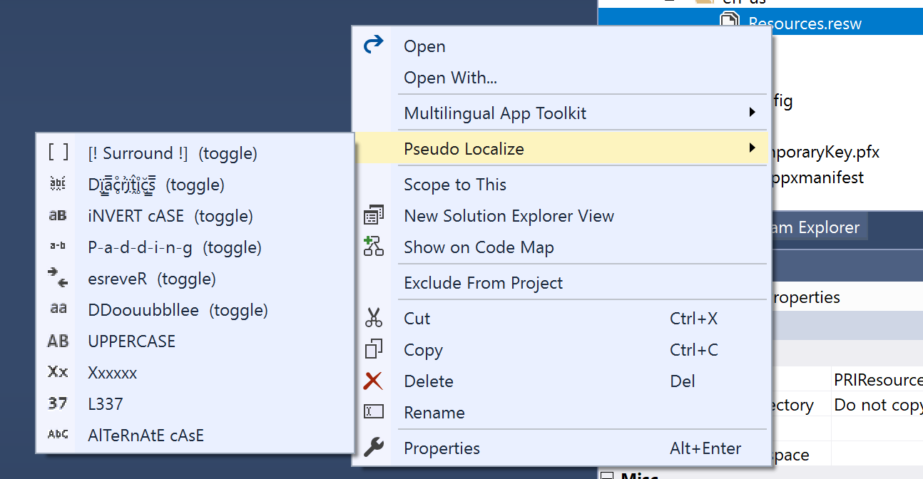
I have a tool to help test the localization of strings in an app. It does this by making changes to the resource files (.resx & .resw) to help make it easy to test that all content is coming from the resource file. There are a number of different options available and more on this is covered in my book.


I've just released a new version (3.0) that adds a single new feature.

The new feature is that it creates a backup of the original file before it changes the content.

I know that it can be frustrating when tools create unnecessary extra files but I feel this is better than someone getting into a situation where they lose lots of work.

There's an option to turn this off if it's not wanted but it's on by default as that's better for avoiding unexpected negative consequences.

This isn't the result of someone having a problem. Rather, it's me trying to avoid a problem before it occurs.
Someone did ask how to get back after they'd toggled one of the options (you just need to toggle it again to undo the change) but I realized that not everything is obvious to everyone and there are all sorts of developers with various skills, knowledge, and experience.
In case anyone ever converts all their resources to something that can be automatically reversed, and they don't have another copy, and they don't have source control. At least they'll now have a backup.

If you're interested in trying out this extension, you can get it from the VS Marketplace.

Thursday, January 23, 2020

Usability Matters for the Surface Neo and the Surface Duo

Concept images of Surface Neo and Surfsce Duo devices


In my book (Usability Matters), I cover details about identifying reasons for building apps and planning app development.

Before the new surface devices arrive and trying to avoid the hype, in this post, I want to use the structure and pointers from the book to highlight important areas about which to think.

Assuming you have an existing app and are thinking about adjusting it for these new devices.

Are these devices going to be available where your users are?
These devices are unlikely to be available globally when launched, or even in a few months after. Using the launch of previous Surface devices as a guide, expect them in North America and parts of Western Europe first. If that's not where your users are, then you may be able to wait and learn from the real experiences of others before needing to do work yourself.

Are your users likely to get these devices?
I don't know anyone who reasonably expects these devices to be cheap. They're new, cutting edge devices pushing the boundaries. Such devices aren't something that usually comes cheap. Other Surface devices do not have price tags that make them accessible to everyone. It's tough for device manufacturers to make money from selling devices*, and this also points to an expected higher price point.
If your users aren't already using high-end devices, it's unlikely that they'll start using these devices (or similar) as soon as they're released.

* As an aside, I heard recently of a manufacturer planning to leave the handset business as it is so hard for them to make money.

Will the devices provide opportunities appropriate for your app and users?
At the moment, it's hard to know. What will happen when "real people" get to use these devices? Will they use them in the ways you or Microsoft expect? You will need to research to find this out. While this may not be possible for you yet, what you can do is make sure you understand what your current users are doing. To do so will require adding usage analytics into your app if you don't have them already. 

What is your goal in attempting to understand and develop for these devices?
  • Is it curiosity?
  • Are you a Microsoft fan who is only interested as this is something they're doing?
  • Do you aim to ensure an adequate experience when someone uses your app on such devices?
  • Do you hope to take advantage of the unique opportunities the new form factors will provide in terms of ways of working or using a device?
  • Or, are you looking for a possible boost from being one of a (potentially) small number of apps specifically built or updated to work with these new devices upon their launch?
If you understand your motivation, you'll be able to work towards achieving the related goals. It'll also help you avoid setting inappropriate goals or retrospectively thinking you were setting yourself up for a different possible outcome.

What can you learn from other, existing, two-screen devices?
While there will be differences between the Surface devices and what's currently on the market, there are lessons that can be learned from the similarities or otherwise.

How might you need to think about redesigning different screens for larger sizes?
Do you need to think about dynamic layouts, different orientations, or assets of different sizes?
Will you need to make any changes to your existing logic regarding assumptions about devices based on screen sizes, the number of screens, or device input?

Have you thought about your expectations?
Document your expectations. Then you can act accordingly. Check how they reflect reality or need adjusting as more information comes out.

How are you planning for these new devices and being ready for them?
Set aside times and monitor timelines to learn about, research, and experiment with them. Think about how SDKs, tools, emulators, controls, design concepts, device specs, and announcements about distribution and availability.


Tuesday, November 26, 2019

Recommended Reading: non-code related books for people creating software.

Books are great. Of course, you should read mine.
When you've read that, I recommend the following books to all software developers, even though they're not about code.

Badass: Making Users Awesome – Kathy Sierra (O’Reilly, 2015)

This is a great book about how to focus on what will make your product (app) invaluable to the people who use it. The focus isn’t on apps, but you can easily apply the lessons of this book to apps and games to help make them better. Read this book if you want to create something people will love.
[amazon]

Design for Hackers: Reverse Engineering Beauty – David Kadavy (John Wiley & Sons, 2011)

This is a great book full of useful, practical instructions for creating beautiful, well-designed interfaces. The focus of the book is primarily for web design and development, but it highlights fundamental principles that developers can easily apply to the UI of apps. Read this book if you’re not a designer, but would like to improve your design skills.
[amazon]

Elements of User Experience: User-Centered Design for the Web – Jesse James Garrett (New Riders, 2002)

This book provides an accessible introduction to the world of user experience (UX). Like many of the other books listed here, it focuses on web development but also shows how to apply what it teaches to other areas too. The book provides an overview to UX and has a structure for explaining its key components (elements). Read it if you want to learn more about the formal discipline of UX.
[amazon]

Rocket Surgery Made Easy: The Do-It-Yourself Guide to Finding and Fixing Usability Problems – Steve Krug (New Riders, 2009)

This is the follow-up to Steve’s earlier book, Don’t Make Me Think! The earlier book was an introduction to the importance of usability in websites; this book explains how you can run usability tests yourself. This is another book written for people developing for the web, but it’s also widely applicable to mobile app development. Read this book to learn how to begin performing your own usability testing.
[amazon]

The Design of Everyday Things – Donald A. Norman (MIT Press, 1988)

This book is a classic introduction to design. It’s about more than just how things look and work, as it also considers the importance of understanding how they affect the people who use them and the businesses that create them. Read this to learn more about the principles of design and how they affect everything you use and create.
[amazon]


Friday, March 16, 2018

Did someone really design this ATM experience?

As I put my card in the ATM machine today I noticed a message on the screen that said
Receipts currently unavailable
I've seen it many times before. It means the roll of paper the receipts are printed on has run out. Not a problem, I just want cash.

After inserting my card and entering my PIN number, among the many options were two related to what I wanted:

- Cash with receipt
- Cash with no receipt

Yes, that first option makes no sense based on the message shown at the start. But wait.
I selected the second option and was then asked:
Do you want a receipt for your transaction?
- Yes
- No

I selected "No". I didn't want one and, based on what the machine had said moments ago, I knew it couldn't provide one even if I did want it.

I then selected the amount I wanted to withdraw.

All should have been good but then I was asked, again:
Do you want a receipt for your transaction?
- Yes
- No

Again I selected "No" and finally my money was dispensed.

Part of me was glad to finally get my money.
Part of me was tempted to try that again and see if what would happen if I chose some of the impossible options.
And another part of me was saddened by the process.

Here are my issues with what happened:

  • The software repeatedly provided options for things it had said were unavailable.
  • The software asked the same question multiple times, seemingly disregarding my past answers.
  • The software made the process longer and more complicated than was necessary.


Someone was paid to make this software.
Someone tested and approved this software.
Someone thinks this is a good experience to give to their customers.
Someone thinks that we should trust them with our money inside complex financial systems when they make what should be a simple piece of software unnecessarily complex.


You wouldn't build software that provided an experience like this.
Would you?

Tuesday, January 03, 2017

Saturday, August 20, 2016

The Starbucks app update—an analysis

Reposted here although originally posted on medium


Shh. Here’s a secret. I think there’s a part of me that wants to be a hipster. It must be true because I sometimes work in coffee shops — just like the cool kids.

This morning I went to town to do some writing in Starbucks. I go there quite a lot. Enough that many of the staff know my name and my usual order. Also, for the sake of this story, enough that I have a Starbucks card to make payments and collect stars (for rewards including free drinks.) Because I’m me and because they have one I also have the app version of the card on my phone.

Here’s what happened today:

  • I entered the store.
  • There was no queue — yay!
  • Went to the counter and gave my order. (It was someone I didn’t recognize serving.)
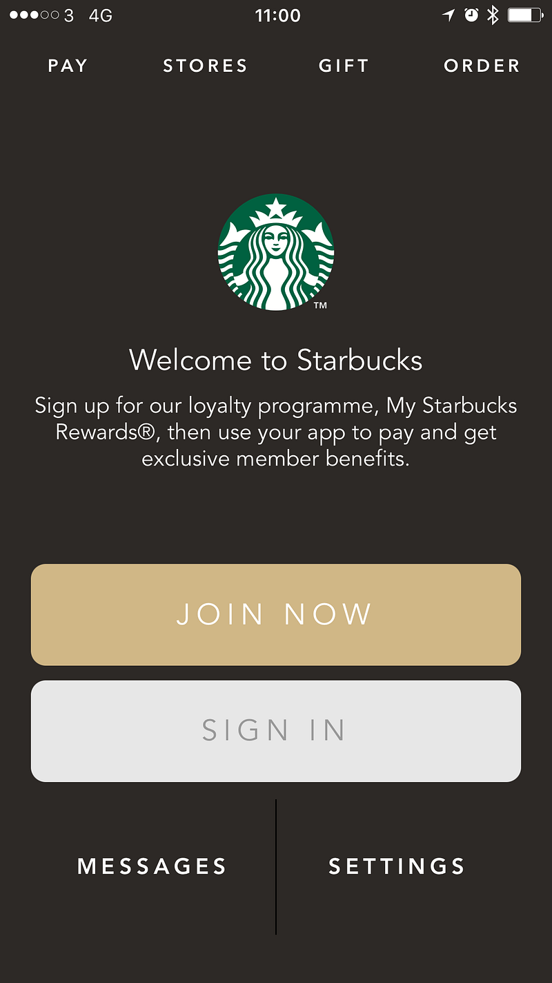
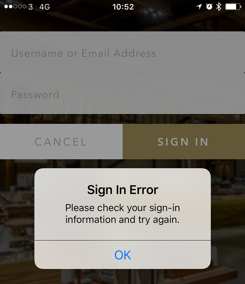
  • I launched the app on my phone and was presented with a screen that showed I wasn’t signed in. :(


  • I quickly tried to sign in after giving them my order (Venti, vanilla, Latte if you’re interested)
  • Sign in failed.


Side note: notice the mixed use of “sign in” and “sign-in”. Don’t do that. Be consistent.

  • I go to re-enter the password but see my email address has been deleted. (It’s hard to check something that’s been deleted.)
  • I mutter something under my breath.
  • The barista at the till looks at me waiting for payment.
  • In frustration, I put down my phone and take out my wallet.
  • I hand them my card while mentioning that “the app logged me out.”
  • They say that “that’s happened to a lot of people this morning”.

I wonder how many people, at this store and across the country, have been affected.

That’s people who’ve been frustrated by the fact that what should have been a quick, simple process wasn’t.

I wonder how much it delayed people during busier periods earlier this morning. That’s individuals affected by the delay to them as they have to log in again. Also, people kept in queues longer while those in front of them struggle with the app. Was it enough for anyone to miss a bus or train? Was it enough that people left the queue early because it was moving too slowly?

Because I’m me, I wonder what had happened in the app and decided to take a few moments to investigate and see what lessons can be drawn from this.

As the people using an app are the most important factor in the UX of an app, let’s start there.
It’s not good. The experience created negative emotions towards the brand. I was made to feel frustrated and disappointed that:

  • paying for my coffee which is supposed to be simple and frictionless wasn’t.
  • I had to enter my email address more than once for no good reason. (They obviously don’t care about unnecessarily wasting my time.)

Ok, so what about the app?

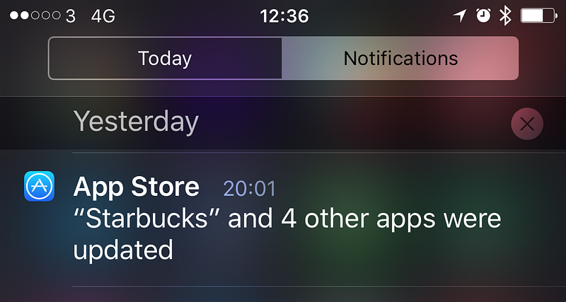
My initial assumption that as the phone hadn’t been updated or rebooted since I last used the app the app must have been automatically updated.

A quick check and a helpful app store notification shows that’s the case.


I have automatic updates turned on because I want to get the latest versions of apps as they become available.

Having auto-updates turned on is good for the publishers of apps too. When they release updates they want people using them as quickly as possible so they don’t encounter bugs that are fixed and can take advantage of new functionality. You don’t want to spend time creating an updated version of your app only to have no one use it. (This is why, in my book, I claim that update notification is the most important feature that every app should have.)

Ok, so there was a new version that was installed.

Now let’s see about that sign in experience.


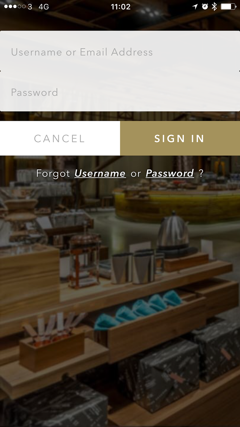
It looks like a regular sign in screen but let me poke at it a little.

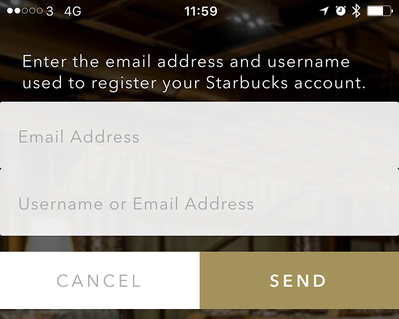
“Username or Email Address” they appear regularly together on registration and sign in forms but they’re not always both needed. Well, email addresses are normally needed. But usernames? Not so much. As a credential for identifying myself to the service, an email address has the dual benefit of being unique and a token for contacting me outside of the app/service. I can’t think of any good reason for needing a username for my Starbucks account. If Starbucks want to address me they should use my actual name (which I told them when registering.) If this was an app that would allow me to connect with other people who use the app then a username would be a good, simple way of identify different people. For instance, on Twitter I have the username@mrlacey. You can use this to find, mention, or message me. It’s much easier than trying to differentiate me from all the other Matt Lacey’s in the world and it doesn’t make anything potentially private about me public. But I don’t communicate with other people who are using the Starbucks app. So, why do I need a username?

Maybe I can create a username to make it easier to sign in.

But (I think) this is only the second time I’ve logged into the app. Why add something I need to remember to perform a task I rarely have to do? I don’t know what my username is. I can probably guess but don’t want to have to. I know what my email address is so why wouldn’t I always use that?

If I’ve forgotten my Username there’s an option for that.


If I’ve forgotten my username I can use my email address to recover it. This is redundant!

The flow for recovering a forgotten username is:

  1. Select ‘Forgot Username’ option
  2. Enter email address
  3. Go to email client and (when the email arrives) retrieve the username
  4. Return to the app and enter Username and password to sign in

Or you could just ignore the username all together and log in with email address and password. The above flow requires entering them both anyway. It just adds a lot of extra, unnecessary steps too.

“Fun” side note: While writing this I went through the ‘Forgot Username’ flow as I was curious what my username was. It turns out it’s the same as my email address. There’s an acronym for this which starts with ‘W’ and ends with ‘F’.

What’s my username good for? I’m not sure.

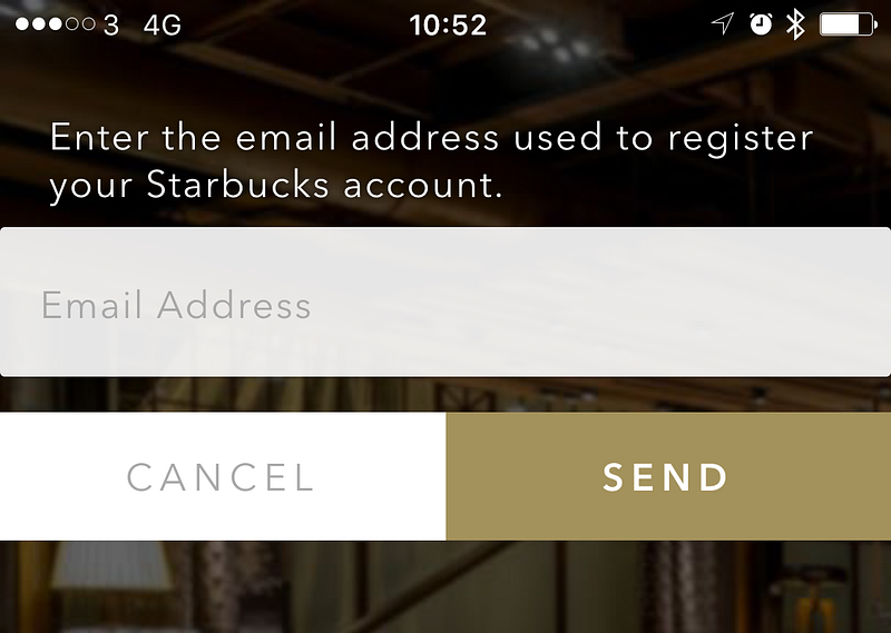
While I’m here, let’s look at the forgotten password flow.


What the what!?
I need to enter my email address and my “Username or Email Address” to recover my password. So, can I enter my email address twice? Or is the label on the second text entry wrong? Either way, I’m starting to have serious questions about how or if this was tested. And the process that led to this situation.

Maybe the username exists as a way to try and prevent the malicious validation of email addresses registered with the system by deterring the automated, brute force entry of values in the password recovery process. If that’s what’s happening, it’s trying to solve the problem in the wrong way and is undermined by the username recovery option.

Despite what you might be imagining based on the above I manage to correctly sign in with my second guess at my password.

Now I’m logged in and using the app again, what’s new in this version?

A quick scan of the different parts of the app and I don’t see anything obvious.

I wonder if there’s any details listed in the app? ‘Settings’ is where I’d normally expect to find this (if it exists.)


Sadly, there’s just a version number. I don’t know what version I had before so this doesn’t tell me much but it looks like a small update (based on the number) so I wouldn’t expect much to have changed.

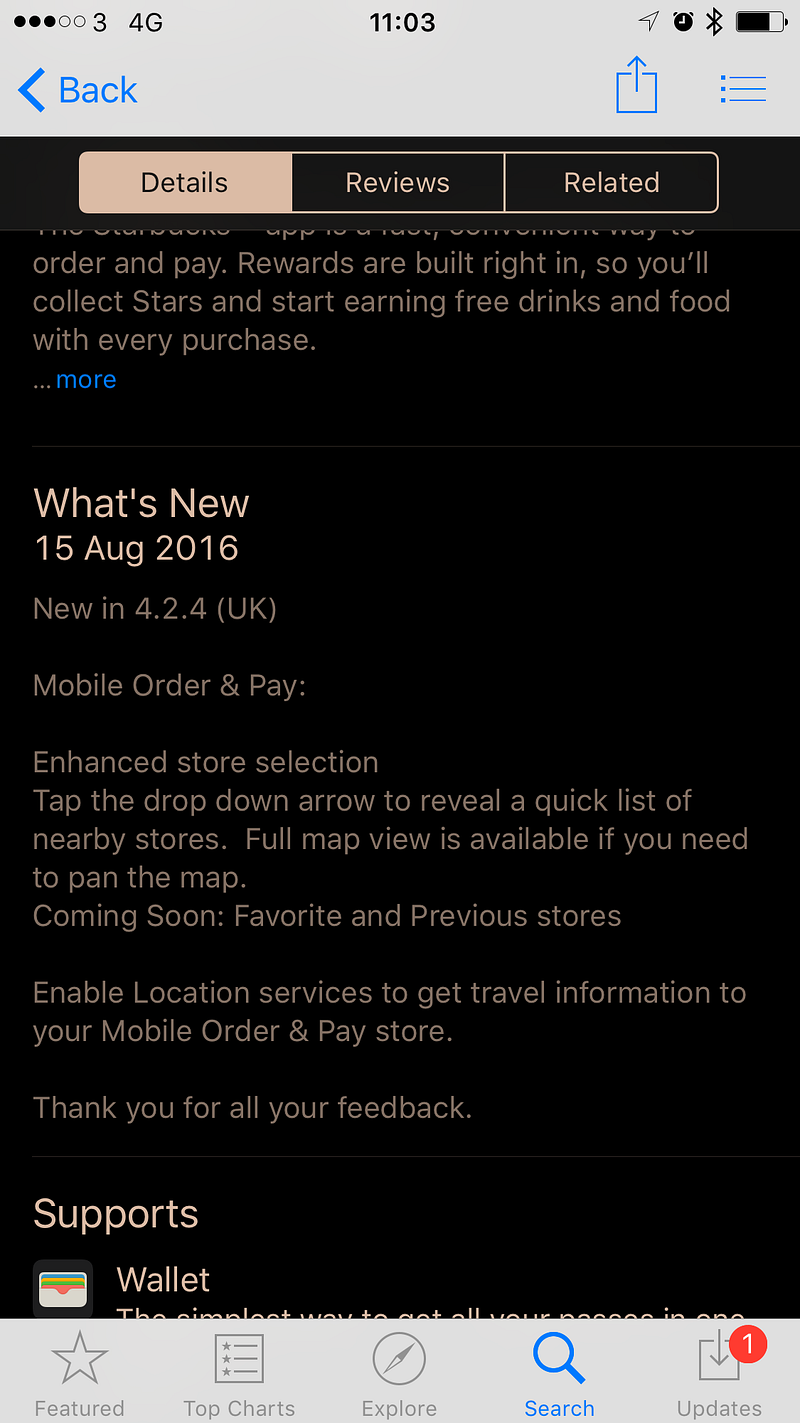
Let’s see if the store listing can tell me any more about what’s changed?


It can tell me something, but it seems little has changed. Just small changes relating to store selection and the displaying of maps. These are not features I use. This means I went through all this and got nothing from it apart from something to write about in this post.

Oh, they say “Thank you for all your feedback.”

Give all the above, what can be learned from this experience:

  1. Don’t force a person to re-authenticate with an app after it has updated.
  2. Don’t let an update cause saved data (including access tokens or cached credentials) to be lost.
  3. There is no functional or security related reason to delete an email address after a failed login attempt. It only ever creates more for the person using the app to do.
  4. Only require people to create a username for your service if they’re going to use it to communicate with other users of your service.
  5. Be sure that the labels for what people can or need to enter are correct.
  6. Use terms and labels consistently. (e.g. Don’t mix use of “sign in” and “sign-in”.)
  7. Don’t add arbitrary complexity on the assumption that it will help improve security.
  8. Test your registration, sign in, and credential recovery options thoroughly.(If you’re not confident in doing this then you could ask or hire me to help.)
  9. When an app is used for the first time after it has been updated, acknowledge the update and provide access to details of what’s changed.
  10. Make it easy (and obvious) for the people using the app to submit feedback.
  11. Bonus: I can tear apart and find issues with any app. ;)


The reason I write posts like this is because I don’t want to have experiences or use apps like what’s detailed above. I don’t just want to complain but help people learn how to identify and fix such issues. If you can see other people making mistakes and learn from them it will, hopefully, help you avoid similar issues in future.

Tuesday, June 28, 2016

Commission a logo before building an app


Last month I wrote a guest post on the UK Microsoft developers blog:
Have you ever thought (or heard another developer say) something along the lines of this?

"I've finished the app, now I just need to create a logo and then I can submit it to the store."

As the title of this post might suggest, I want to share with you why I think being in such a situation is a problem.

To build and promote an app before worrying about how it looks is a traditionally developer-centric approach. Of all the people who have created successful apps that I've ever spoken to, or heard from, they claim that between just 10 and 40 percent of the success comes down to coding. It should, therefore, be clear that there is more to success than just writing the code and releasing an app.

Promotion of an app, whether paid or otherwise, is a key factor of success. This promotion shouldn't start only when the app is complete and ready to be submitted to the store.

...

Read the whole things at https://www.microsoft.com/en-gb/developers/articles/week04may16/commission-a-logo-before-building-an-app/

Monday, March 16, 2015

Slide view / splitview / side draw and a hamburger are not necessarily the same thing


There has been a lot of discussion about some of the native apps in the Windows 10 technical preview releases using a hidden menu, accessed via a "Hamburger icon". Some people have taken great offence to this and object to it's use in Windows Apps.
Let's get a few things clear though:

  • The hamburger icon is a variation on the icon for a list that represents a menu (a menu is just a list of options anyway)
  • It's typically used on a small screen device, where space is limited, to allow for the person using the software to cause the menu to be displayed. The menu is not typically shown all the time because of the amount of screen real estate it requires.
  • In addition to being useful on small screen devices, it's also useful when the size of the window can be changed and vary greatly.
  • The idea is to hide the menu off screen until it's needed.
  • The downside is that the person using the software doesn't know what's in the menu until they open it. If they don't use it regularly and/or it contains a long list of options then they have to remember what's there. Or, more likely, they have to open it to see what options they have.
  • How the menu is displayed is not related to using the "hamburger" icon to represent it.
  • You do not have to use a side draw or slideview to show a menu.
  • Using a side draw or slideview does not require the use of a hamburger icon. You could use something else. Even text.
  • It's a convention though. Many people already recognise the hamburger icon (even if they don't call it that) and have an expectation about what it will do.


You don't have to use a hamburger icon in your [Windows 10] app.


Monday, October 13, 2014

Book Review: Designing Mobile Payment Experiences - Skip Allums

Cross-posted from http://windowsapps.london/2014/10/13/book-review-designing-mobile-payment-experiences-skip-allums/

Back in the late nineties I worked on a system that produced store gift cards/vouchers. Fast forward to 2008-9 and I was working on mobile payments, NFC payments, stored value cards on mobiles and even custom software for chip and pin terminals. More recently I've worked with a number of banks and money transfer services to build them mobile apps. (There are more than a couple of screenshots in the book that look VERY familiar!)
All in all it's fair to say I have an interest and background in working with mobile payment solutions.
When I first heard about this book I became very interested. Mobile payment and money transfer is an area which I expect to grow considerably in the next few years and the recent announcements by Apple, with the iPhone 6, will only help fuel interest in this area and speed up growth.


The book is relatively short at just 7 chapters and a little over 200 pages but it's packed with useful information.

The first chapter starts the book by providing some background on the history of money and how and why it is used. It provides the perfect grounding for the rest of the book.

The second chapter introduces the three payment types covered in the book: NFC; Cloud : and Closed loop. The description of each of these is intermingled with a few UX notes dotted about. I think it would have been nicer to have made the UX points stand out more. As I am familiar with the payment options and their pros and cons I would have liked to see the UX tips stand out more form the text so I didn't risk skipping over them as I skimmed a paragraph about a subject I am already familiar with.

The third chapter is the first to provide some easy take-aways for the reader. It analyses the strengths and weaknesses of the design, payments, feedback and security aspects of popular mobile payment solutions available today in the US. Namely Google Wallet, ISIS, PayPal, LevelUp, Starbucks and GoWallet.

The fourth chapter is about building trust into mobile payments. It was while reading this chapter that I realized I had been reading this book with my "developers hat" on, rather than one of a designer. I think of myself as a developer who wants to understand design. I also hope that more developers take an interest in design and how it impacts what they are developing. Anyway, this chapter diverged from what I was expecting and had a strong focus on the psychology of the consumer (or person using the app). I found it really useful to have this focus and the idea of designing for the most common security concerns people have with mobile payments was explored in depth in the rest of the chapter.

The fifth chapter is about actually designing successful payment interactions. The chapter is full of useful advice if creating an interaction using NFC, Bar or QR codes, or geolocation. It even made me smile as I remembered back to building an app that displayed barcodes on an iPhone and testing it in actual supermarkets. I'm sure with the information from this chapter I could revisit many past applications and create improvements. My only criticism would be that it would be nice to touch upon iBeacons or similar when also focusing on geolocation as that would, I suspect, address some of the issues of a geolocation approach. (e.g. getting the wrong neighboring store.)

Chapter six feels somewhat of a mish-mash of topics. This is probably due to the nature of the chapter being about additional services that can be provided with a payment experience to bring a richer and more valuable user engagement. Depending on the original app or services purpose is will affect what additional services are appropriate. This chapter provides guidance on: managing finances; rewarding loyalty; offers and coupons; and travel.

The final chapter looks to the future. As Apple has such an influence in the mobile space (especially in the US - the market this book focuses on) it is right that there is talk about what Apple may do. (This includes consideration for iBeacons-as noted earlier.) Then there's speculation on what may come from MCX (the Merchant Customer Exchange) and Facebook. The chapter concludes with a look at wearable devices and bio-metrics and how they may be part of payment experiences in the future. As it's still early days for these technologies the book provides no specific guidance in using them though.


All in all a useful book. If you are, or are likely to be working with mobile payment with regard to mobile devices and apps then I recommend you buy and read this book.


There is also a website by the author that contains additional content (via a blog) and a collection of mobile wallet & payment UI design patterns: http://mobilepaymentux.com/


Disclaimer: The copy of this book was supplied for review as part of the O'Reilly User Group/Community program.


Thursday, July 24, 2014

On "Responsive Design"

What your design should be responding to is the context of the user. Not just the device they're using.

It's about more than just screen size and capabilities.

It's about enabling the person using the software to get the value they want out of using the software regardless of which device they are using.

Of course, understanding the context of the user (so you can best give them what they want) requires consideration of more than just the size of the screen.


And although it should go without saying you can't put all the logic to do this on just the client side or just the server side. (Assuming you have both - some apps may only be client.) Some of the logic to do this will need to be on the server and some on the client. The client will tell the server general information to the server which will impact what the server returns. The client will then refine this to the specifics of the device. Allowing for consideration of its current configuration and its current environment.

Wednesday, July 09, 2014

Think before you truncate

There is a convention on Windows Phone to not wrap text but let it overflow the right edge of the screen.
This shouldn't always be done though.
There are cases where the text at the end of a sentence is REALLY important and it's more important to compromise the convention or the layout so that the information that matters can be seen.

Take a look at these directions (from the maps app).
In the second step, is the street I should take on the right or the left?
It's important I know. 
This shouldn't have been clipped.
The arrow doesn't make it obviously clear either. 


Fortunately, in this case, the apps supports rotation and by switching to landscape I can see that I need to take the road on the left.


It's a work around for this instance but not all apps are as good.
Even in this case though it would have been better if the app didn't give me that initial moment of confusion and frustration.

Is there anything you could do to your apps to make sure that the most important information is always visible?
Or would supporting both portrait and landscape orientations in your app allow the people using it to see things more clearly?


Wednesday, March 19, 2014

What "phone", "watch" and "computer" really mean

Just thinking out loud here...

We use the term "phone" to refer to many more devices than we did a few years ago.

Untitled

When referring to phones we now, more typically, mean the devices we carry in our pockets and may try to differentiate them by calling them "mobile phones", "cell phones" or maybe even "smart phones"*.
In reality though there's only a very small part of these devices that are to do with making a phone call. The name is more of historical consequence and an aid to differentiation. It's easier to say than "handheld computing device". (Although that's how they describe them on board aircraft.)


We're now starting to hear a lot about "wearables" and "smart watches". Aren't these just small computers that are easily worn on the wrist?

We, typically(?), still think of computers as those devices with a large screen, keyboard and a box on, or under, a desk. And sometimes maybe we think of a laptop when we think of "computer".
I suspect this thinking is limiting our ideas about what certain devices are and what we should be thinking about them as being capable of.

Everything is becoming a computer. More things than you realise probably already are.

What happens when we stop talking about "smart phones" and "smart watches" and instead talk about "computers we carry in our pockets" or "computers we wear on our wrists"?
Yes, it's slightly more wordy but will changing the language we use change the software and experiences we envisage and create?

When we're planning the future where our use of technology is even more integrated with our lives and our experiences with technology crosses over a wider range of devices this will become increasingly important.

Terms like "computer", "laptop", "tablet", "[smart]phone" and "[smart]watch" are helpful, at some level, for differentiation but risk limiting our thinking. Building the technology of a better future means we need to avoid limiting our thinking and push things forward.


* I'm ignoring any smart phone vs feature phone differentiation


Sunday, March 09, 2014

Visual design is nothing without UX design

This is a break from my usual, more technical posts, indulge me for a moment.

So, I was looking at Etsy on one of my Android tablets as I'd remembered it being highlighted as an example of an extremely well designed app. What follows is my experience as a first time user.

  • I opened the app fine and was immediately shown trending content. Good, no barrier to use, no awkward tutorials and no unnecessary sign up/registration before it was needed.
  • I eventually came across something that I thought would make a good present and was quite cheap (at just £12.43). I decided to mark it as a favourite so I could come back to it later if I did decide I wanted to buy it. The empty heart shaped in the top corner looked just the thing I needed.
  • Tapping on the heart prompted me to sign in or register. As I was only just starting to engage with the app and its content it would have been nice to save my favourites locally on that device without the need to first register. Oh well.
  • During registration one of the required fields was for "Email or Username". As I started to enter my email address I thought it odd that the @ symbol wasn't promoted on the keyboard. Never mind I thought and entered my email address only to be told that I'd entered illegal characters for that field. :( I therefore couldn't enter my email address here (I'd already included it in the "email" field anyway so just chose a username. Why make me choose a username? All the ones I'd usually use had already been taken so I'll probably forget it anyway.
  • After registering and marking the item as a favourite I returned to the trending list and continued to browse. As I did so I noticed that the items I was now scrolling to had prices listed in USD, while previously they'd been in GBP. I scrolled back up and there was a definite change slightly after the item I had been looking at while registering. Having a suspicion what had happened I went looking for the app settings. There I found a setting for currency that was set to USD and not the "Device default" of GBP. It seems that after registering on a device configured for "English (UK)", being used in England (if they done a geo-IP lookup) and after registering with an email address that has a ".co.uk" domain they thought to change my currency setting to USD. How thoughtful?
  • So, after a bit more browsing I decided I would purchase the item I had looked at earlier. The item could be personalised so I looked how this was specified and was told it was done as part of the checkout process. So off I went to pay.
  • At the checkout everything had switched again to USD, presumably because I was buying from a US retailer but it would be good to have this made clear to me.
  • I chose PayPal as an option (nice to see on a mobile device as it meant I didn't have to enter as many details-card, address, etc.) And completed my purchase.
  • At this point I realised I hadn't been given personalisation options. Never mind, I'll just contact the seller and send them the details. I found how to do this easily but I couldn't send the message. It seems that you can't contact the person an order has been placed with until my email address had been confirmed. Yes, they'll take my money and place my order without verifying my email address, but ask a question about the purchase I've made. That's obviously a no no. They'd made access to email an artificial barrier to a secondary task. in this instance this was particularly frustrating as I didn't have access to the email account I'd registered with on the device I was using. (Admittedly I use a wide array of devices way in excess of what normal people do and I don't keep all my email accounts configured on all devices. - As it becomes more common for people to use a wider array of devices in their lives expect this to be a bigger issue.)
  • Eventually I got everything sorted and even had email acknowledgement that my order had shipped later the same day.
So what about the app overall?

Technically it's a good app: interesting content, no bugs or performance issues that I could see. Just the need for a bit of refinement.

Sadly, we're still in a position where the best apps aren't truly amazing.


Visually, yes it's a good looking app with lots of rich engraving visual content. My experience with using it through was not as good as it could (should?) have been.

Remember, "design" is too broad a word with too many meanings to be helpful on its own. What something does and how it is to use is almost always more important than how it looks.